At Card Kingdom, our customers are what matter most — which is why your experience using the site is one of our central focuses. To deliver the best experience possible, we decided to update our look and we’re excited to share the changes with you.
Since this could catch those who are used to our current layout by surprise, we wanted to ease the transition by walking through all the important changes. However, please keep in mind that while these images and descriptions represent the general direction we’re moving in, these designs may not accurately represent the content shown on the site. By the time the update is finished, there may be some minor differences.
With that out of the way, let’s go step by step through Card Kingdom’s new look!
Starting from the top

Currently, our navigation bar has what you’d expect: a place to sign in, your buy cart and all the important categories that you need to find exactly what you’re looking for.

While this worked in many ways, we wanted to streamline the experience. Now, we have condensed the categories down to the essentials. You may notice we have also added a separate cart up in the top corner to help customers track the cards they are buying and selling. Both carts will also have a distinctly colored number appear to show the number of items in your cart.
Our advanced search is better than ever, too! With the addition of fuzzy search, you will still find the card you’re looking for even if you can’t remember exactly how it’s spelled. You can also find both sealed product by name and cards with multiple names by searching for only one.
Additionally, advanced search can toggle an availability filter on product names to make sure you’re only seeing what we have in stock. And speaking of filters, you now have the option to only see collector booster packs, draft booster packs and set booster packs when searching by product type.
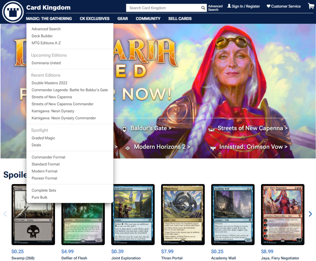
When it comes to our customers, we always want to improve your experiences. With the feedback we gathered from you, we learned that the current setup made it difficult to find precisely what you’re looking for and to explore our product lines in-depth.
For one, the headings of various categories could be hard to distinguish from the individual pages beneath them. The information available also didn’t encompass everything a customer could find relating to a given product line, and we wanted to show our complete catalog.
Fewer categories, more clarity
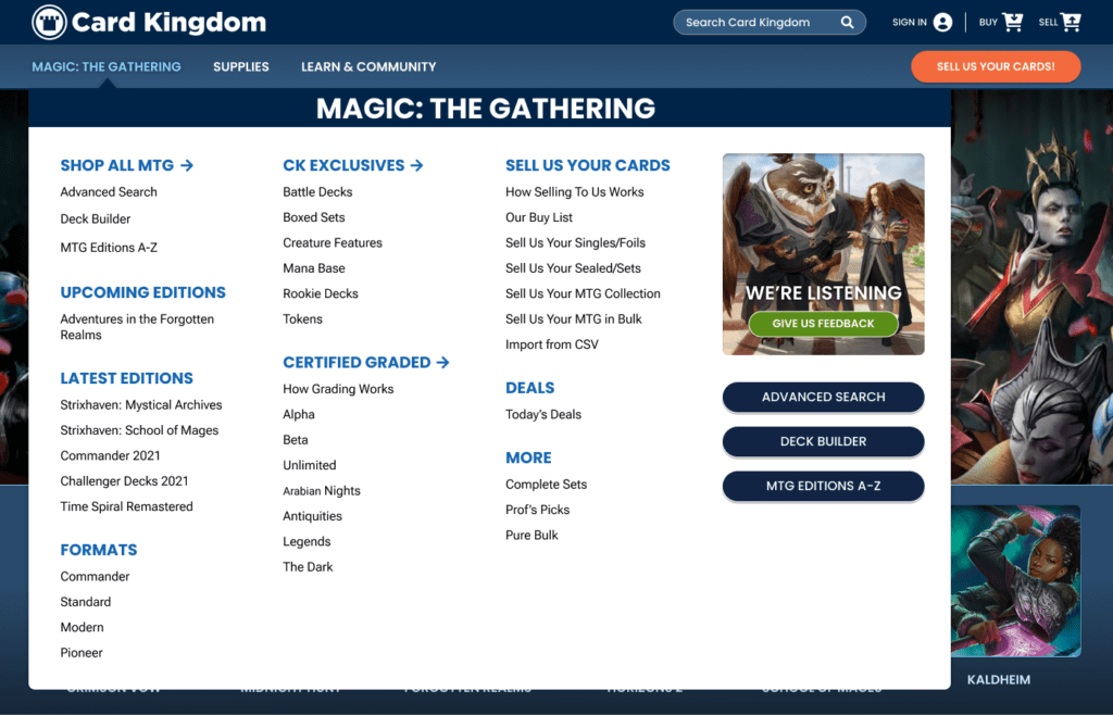
On to the Magic! We designed ways to get you to the card, set, booster, format (and more!) you want faster. You’ll still see all of the options you’re accustomed to with a greater variety of categories, plus easy access to our Deck Builder and Advanced Search
Based on your feedback, we added Card Kingdom exclusive products and Card Selling information in one convenient place. We want to provide access to all of your most frequently used Buying and Selling links.
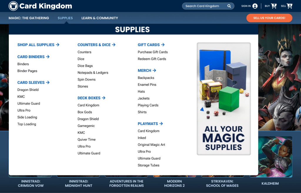
Meanwhile, our supplies section now showcases the products players need more clearly. You’ll find the same categories as before, but you can now search by vendor as well as product type. We also made it easier to find Card Kingdom branded merchandise along with gift cards.
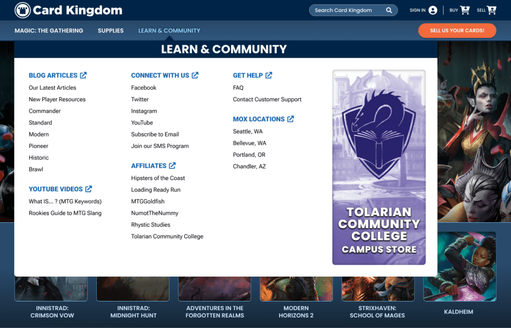
We’re very excited to introduce our Community tab. Let’s first mention that this is where you’ll find our awesome customer service team, who is always ready to help with any questions you have. Otherwise, we look forward to delivering great content and community information through these links. We hope it’s a section you’ll visit often.
Leading this section is an expanded look at the very blog you’re reading this post on. You can now navigate right to the format most important to you, or you can just see the latest article. If reading isn’t necessarily your thing, you can find our YouTube page and all the video content within.
For those who want to connect with us on social media, there are now links to our various platforms and the option to sign up for our regular, email newsletters. You can also find a list of our many affiliates whose content we are delighted to support — and we’ll be sure to update it as new creators join the ranks.
Getting you the answers you need is also part of helping our community, which is why we housed our FAQ and customer support pages here. And finally, you can be a part of our community in person at our various Mox Boarding House locations.
Our best foot forward
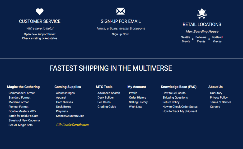
Of course, we can’t clean up the top of our site without doing some housekeeping at the bottom. At the moment, the footer has a lot of redundant information that you can more easily access at the top of the page (where you’re more likely to see it).
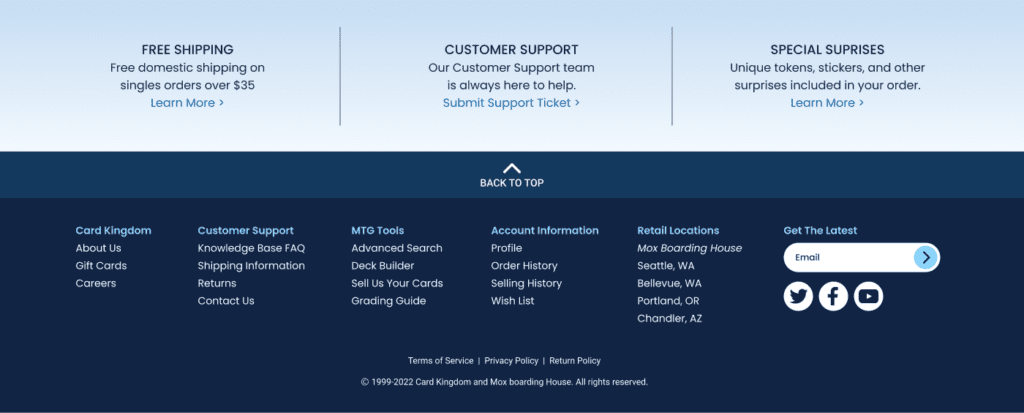
We’re condensing the majority of the information here down to the bare essentials. You can still find our “About Us” page and access your account, plus customer service remains front and center so it’s as easy as possible to find a point of contact when any issues arise. Otherwise, we tried to focus on some personal touches, like our free shipping policy and the many special surprises we like to include in orders when available.
End step
If you made it this far, congratulations! You’re now an expert on Card Kingdom’s new look. Hopefully you enjoy these changes, and know we are always looking to make your experience as enjoyable as possible.
If you have any feedback for us, please let us know by filling out this form.

