Card Kingdom is getting a new look, just in time for our 25th birthday!

Our site is going to look a little different as we roll out the new homepage over the next week, but this is far from a cosmetic change. There are a lot of new and improved features for you to discover. We’ll take you through the process of how we decided on this new design. But before we look forward, let’s take a quick look at where we started and how we got to where we are today.
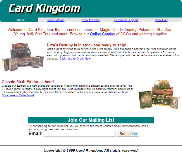
Card Kingdom has been through a lot of changes since we set up shop 25 years ago in 1999 as an early online Magic retailer. Back then, both the internet and the MTG community were young – vastly different from what they are now. Our love of the game and mission to make singles accessible to all kept us growing beyond our humble beginnings in our founders’ basement.
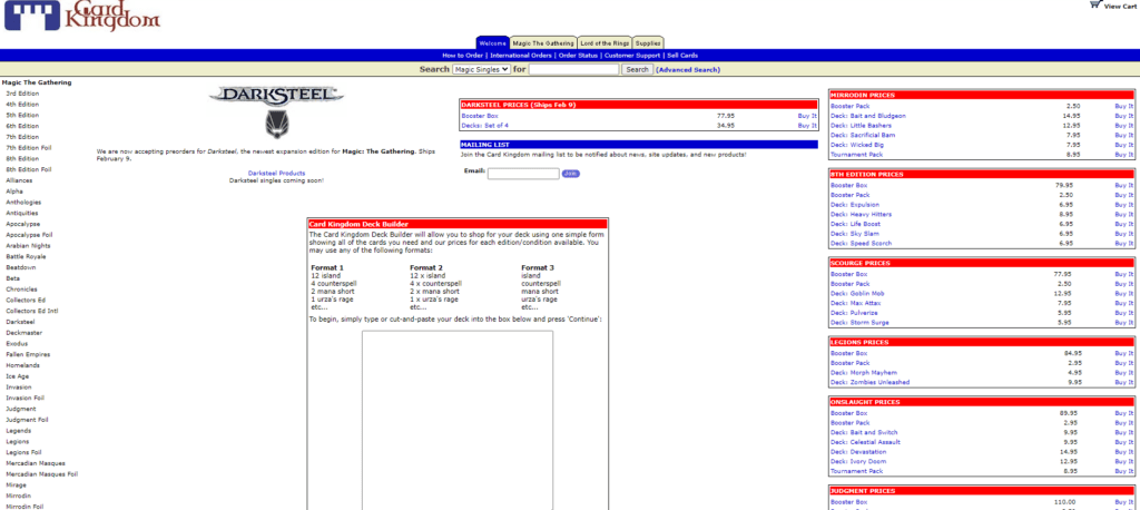

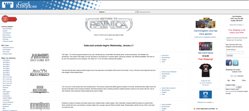

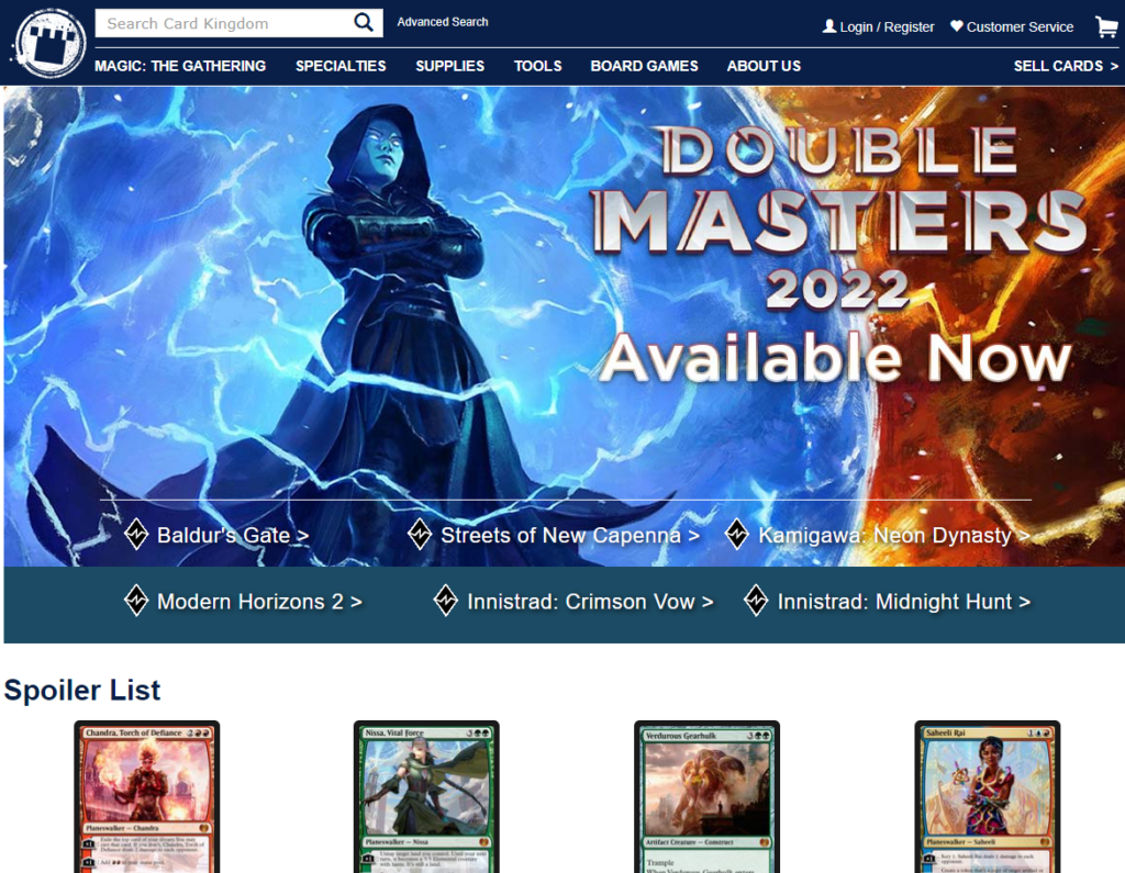

Finally, here’s the Card Kingdom design you’ve come to know over the last few years.
It’s hard to believe there have only been a handful of changes to our homepage throughout our storied two-and-a-half decades of business. Given that, we decided it was time to not only give our storefront a fresh coat of paint, but to start building out some exciting new features that give you more control.
Over the next few weeks, you’ll notice that things look different when you visit CardKingdom.com as we roll out this new experience. Let’s go behind the scenes of these big design changes in an interview with Jeannie Voirin-Gerde, our Senior Manager of Digital Product Experience.

What led us to decide to update the homepage?
We knew we wanted to provide our customers with a better mobile experience as well as provide more content for both new and established customers. We also believe that Card Kingdom should be more than your average ecommerce website and wanted to reflect that with content and design that is more engaging and useful.
How long has development on the new homepage taken?
We started the design, user research, and testing process for the new homepage back in 2022. We knew it was important to fully understand our customers and their needs, then make it easy for our team to create new, useful website content that helps you easily discover what you’re looking for.
What new features does the new homepage have?
- Responsive mobile-first design (a top customer request)
- Support for 4k images
- Make it easy to find the latest sets and explore new content.
This is just the start! More improvements are planned in 2024.
What feature was the hardest to make work?
The overall visual style. There are so many possible options, variations, and styles to choose from. It’s overwhelming to start.
We designed and prototyped a ton of different visual styles and invited customers to test and respond to them. Trying to remove our personal bias and watching users describe how and what they felt when interacting with different styles was a fun and fascinating process.
In the end, we chose a visual style that resonated with our customers and left a lasting impression that both spoke to our identity as a place to shop for Magic, but also as a community centered around Magic: The Gathering.
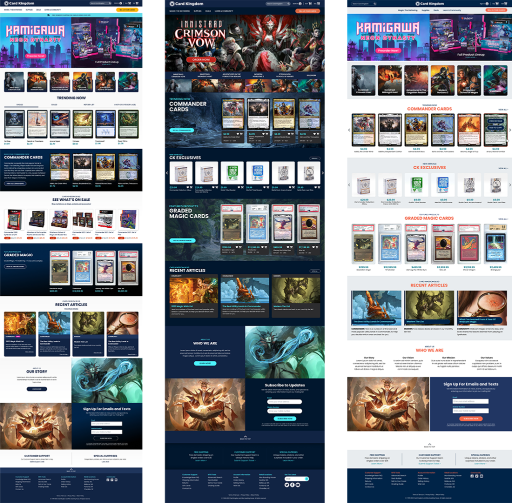
At Card Kingdom, we always strive to bring you the best customer experience possible. We have more features and functionality planned for our website, and the new homepage is a big step toward realizing that vision. We’re going to continue iterating and innovating, and we’d love to hear your thoughts on the changes and ideas for things you’d like to see in the future.
So, look around and enjoy. As always, we’ll be here to help! Here’s a handy place to give us your feedback once you see the new homepage.
Happy Planeswalking!

