
Magic: the Gathering has some truly incredible pieces of art. Some are beautiful, some are terrifying. Some are creepy, gross, or unsettling. Others are awe-inspiring, or cute. Others still are – in a word – pretty. Just a perfect balance of style, color, frame treatments and foiling. Here are ten of the prettiest Magic cards of all time – in our very humble opinion, of course.
10 OF THE PRETTIEST MAGIC CARDS OF ALL TIME
CHANDRA, TORCH OF DEFIANCE – SIGNATURE SPELLBOOK SS3 001
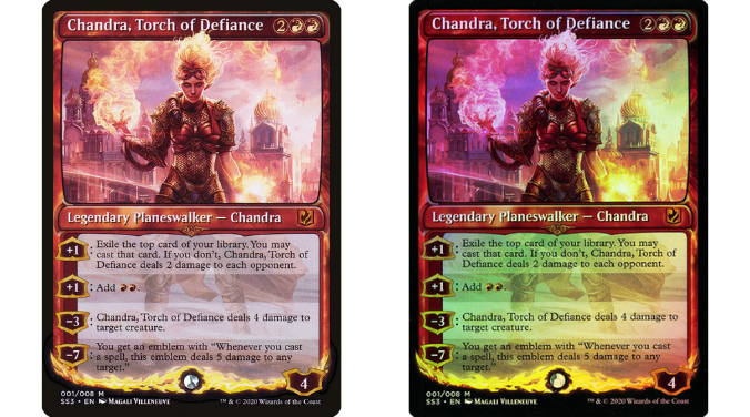
First up, let’s get stuck in with a Magali Villeneuve art. Picking just one Magali art is extremely difficult, but the Chandra Planeswalker from the Signature Spellbook: Chandra is what happens when all aspects of card design converge to create greatness.
Magali Villeneuve’s art is some of her best, which is saying a lot given she’s given us another five years of great art since. The lighting and colors are spectacular, and so is Chandra. What makes this card so pretty is the addition of the Signature Spellbook frame. For Chandra, this means a fiery, bold red frame with flame accents. When you add foiling to this card, you get a truly gorgeous piece of cardboard.
THE WANDERING EMPEROR NEO 316

The Wandering Emperor is one of the coolest additions to Magic’s canon, from her mysterious origins and flare for cutting-edge fabric and armor, to her talent for appearing (and disappearing!) right when you need her. We finally got to meet her properly in Kamigawa Neon Dynasty, and while both arts in the set are fantastic, it’s the Showcase art that stands head and shoulders above.
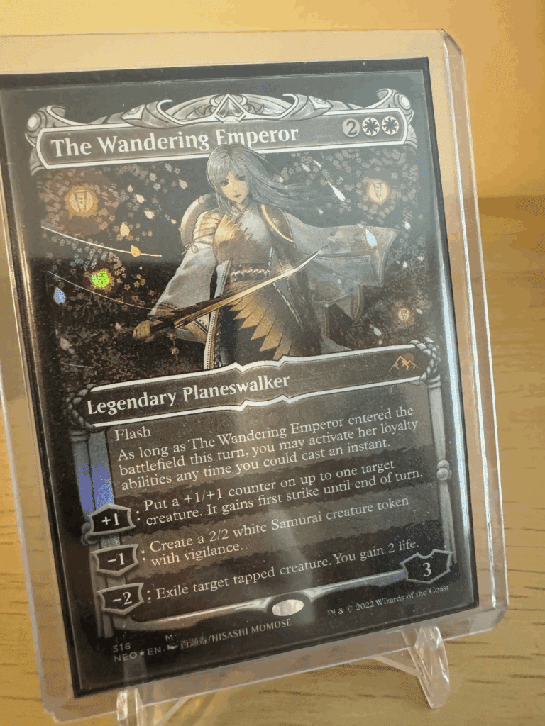
Featuring Hisashi Momose’s take on The Wanderer, this art features gorgeous sakura petals and lanterns, setting up a Hanami vibe. This art is so fantastic I ended up getting it a Playmat. It also, naturally, looks resplendent in foil.
UTOPIA SPRAWL SLD 409

Secret Lairs are where artists get to flex their skills and show us a curated selection of works. There are many great Artists Series Secret Lair Drops, but the Kelogsloops one is one of our favorites. Kelogsloops has an iconic style, one that has since become a part of the canon of Magic artists. Of the four cards in the drop – which also includes Mystic Remora, Retreat to Coralhelm and Burgeoning – it’s Utopia Sprawl that stands out to us.
There’s something delightful and whimsical and pastoral about the art. It evokes Autumn – Akamatsuri, a time to enjoy the stunning red of Momiji and Spider Lily – and the color palette and style is reminiscent of Ukiyo-e while being a modern and evocative piece that stands on its own.
GIFT OF ORZHOVA GTC 209

Another art I have on a playmat – thanks in part to Magic Art Community legend Donny Caltrider – is Gift of Orzhova. This card has always stood out to me, particularly the vibe it generates. Equal parts splendor and tension, the fear gives way to the sublimity of the stained glass and lofty cathedral halls of the Orzhov. The color palette isn’t what you’d generally expect, but works to great effect.
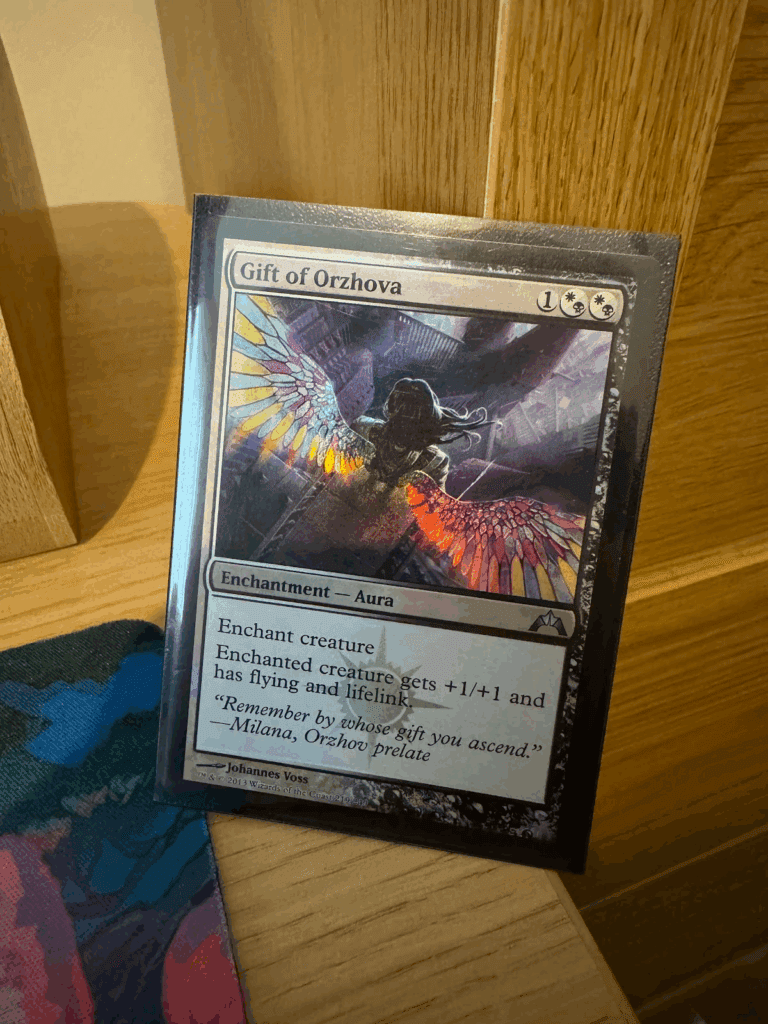
To get the true impact of this card, you need it in foil – and you need the Gatecrash one in particular, as the Orzhov Watermark and pre-Magic 2015 card frame cements the piece as one of the prettiest cards in Magic.
SWORD OF FEAST AND FAMINE MPS 28

The Kaladesh Masterpiece Series still stands out to me as a prestige set of cards, and part of that is their general rarity compared to modern showcase frame cards – and even compared to the later cards from March of the Machine that sought to re-use the Masterpiece frame. What makes this series of cards so pretty is without a doubt the frame itself. The filigree style burnished copper tones really convey that sense of special, and few card treatments since have come close.
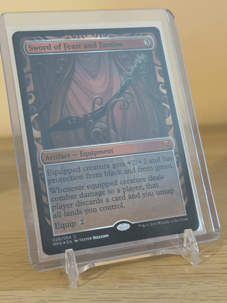
Sword of Feast and Famine stands out here due to how powerful and iconic the original card was – to see it reimagined with the dark husk of metal with the sprouts of new life garnishing the handle is a treat, and the contrast provided by the sweeping folds of burgundy fabric makes for quite the breathtaking sight.
If you haven’t seen one of these in person, you really should. The metallic sheen of the pinline makes them really sing.
WOOD ELVES P30A

Rebecca Guay was obviously going to feature on this list – an artist with perhaps the most association for making ethereally pretty Magic art. While the original version of her Wood Elves is in Portal, it’s the 30th Anniversary Play Promo that takes the cake here. It comes with that old-school approach to foil with the frame itself in foil, and it allows her art to truly sing – with the art being brightened a little to really see those colors. This Wood Elves for me evokes Tolkien’s stories in The Silmarillion, and for that, it tops the list of Wood Elves.
ARCHANGEL OF THUNE M14 5

Existing at the border of historical realism and romanticism, the James Ryman art for Archangel of Thune was one of the first Magic arts that truly gripped me when I started playing, and it hasn’t let go almost ten years later. There’s something about the piece that feels epic and out of this world, without being truly rooted in fantasy. Maybe it’s the boundless clouds, heavy with the potential for a storm – the storm approaching being this Angel’s wrath. Quite and calm, her serenity feels safe. Her tempest will be unleashed elsewhere, punishing evil and injustice.
THIEVES’ GUILD ENFORCER M21 361
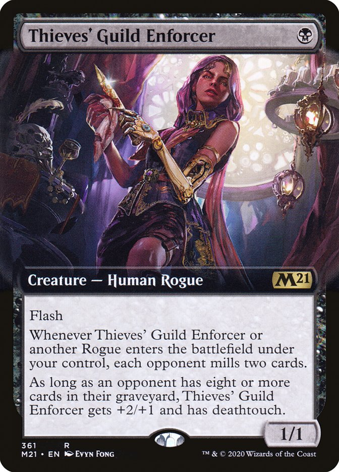
Evyn Fong is one of the artists we’re always excited to see new art from. She’s responsible for great art like Aisha of Sparks and Smoke, Nightsquad Commando, and Sharae of Numbing Depths. There’s something alluring and dangerous about the art she makes – each piece has that Siren-like quality that blends beauty with treachery.
Thieves’ Guild Enforcer is one of the prettiest cards in Fong’s repertoire. It exudes the luxury of the Avishkar apartment where our subject resides – and we’re unsure if it’s the Guild or her latest hit. Her clothes and prosthetic show her taste for the finer things – with the ominous Profane Memento in the background hinting at the fate we might find ourselves in.
SUBLIME EPIPHANY M21 074
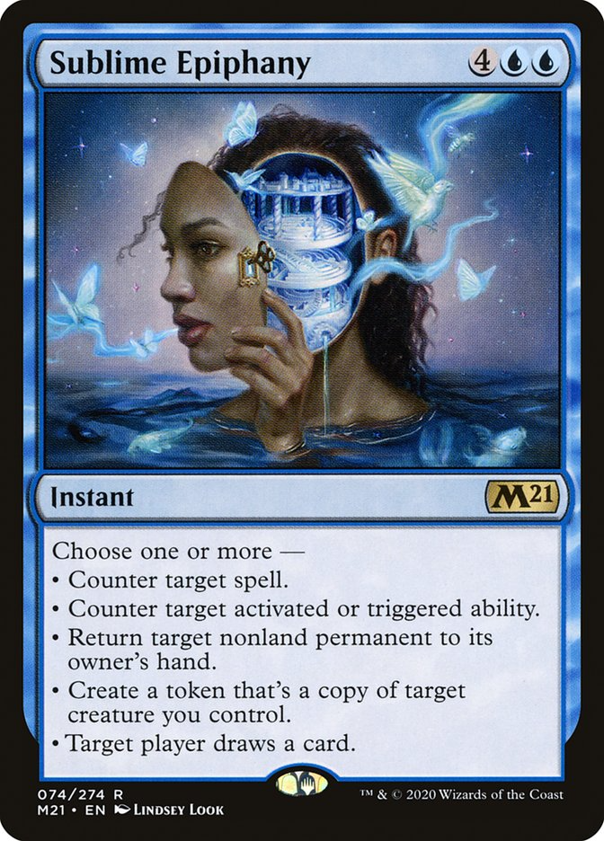
Sublime Epiphany won the Chesley Award, and it’s easy to see why Lindsey Look’s piece captivated the panel. It’s truly breathtaking, as pretty as it is surreal. This kind of surrealism is few and far between on Magic arts, especially historically, and while this is a surrealist piece, it retains its fantastical beauty with the intricately designed inner mind and delicate birds and butterflies. It doesn’t get much better than this.
PATH TO EXILE DCI 24
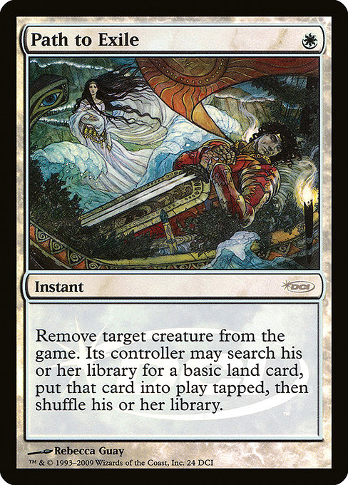
Rounding out today’s collection of pretty cards is arguably the prettiest edition of Path to Exile – a card with many great arts. Rebecca Guay is more than deserving of having two cards in this article (as are plenty of other artists!), but what makes this one stand out to us is the rich contrasting watercolors. It’s evocative of medieval and folklore vibes. Who did this Knight perish to, and what will become of his betrothed and child?
END STEP
Magic has countless pretty cards, and we couldn’t possibly fit them all into one article. Here are just a handful of the prettiest cards of all time. Which are your favorites? Let us know on socials!

Kristen is Card Kingdom’s Head Writer and a member of the Commander Format Panel. Formerly a competitive Pokémon TCG grinder, she has been playing Magic since Shadows Over Innistrad, which in her opinion, was a great set to start with. When she’s not taking names with Equipment and Aggro strategies in Commander, she loves to play any form of Limited.