

In terms of aesthetics, Magic has perhaps the broadest range of any tabletop game. And it gets broader all the time. From its high fantasy roots, traveling to different sets and planes have allowed us to see science fiction, westerns, classic mythology, magitek, cyberpunk, fairytales and even other pop culture IPs through Magic’s cardboard lens.
But by far the most popular and frequent genre detour is into the realm of horror, and every October my fellow MTG writers and I celebrate the ghoulish delights of the many zombie, vampire, spirit and werewolf cards that populate our game.
It’s such a familiar aspect of Magic that we might not bother to stop and ask ourselves why the connection to horror is so particularly strong. By now, those spooky creature types and tropes are simply tradition, baked into the game’s identity by thirty years of repetition. But all traditions originate somewhere, just as Halloween has its origins in pagan religious festivals.
Tonight, let us honor those origins by looking back at how horror and Magic first became entwined, and how the game’s approach to these aesthetics have evolved over time.
ART OF DARKNESS
For the first few years of its existence, Magic did not have a canon setting or overarching storylines to anchor its cards within a common context. Even flavor text was in short supply, so all understanding of a card’s “flavor” had to come from its name and illustration.

With no official setting or flavor to provide direction, it was left up to the first generation of Magic artists – most of whom were young arts students looking for a side gig – to dictate the look and feel of this new card game. You’d expect the result to be a chaotic clash of styles and tones, but if you just look through the card list for Limited Edition Alpha you’ll see there’s already a bias towards the gloomy, foreboding, and outright occult.

I’ve been lucky enough to interview artists like Douglas Shuler and Sandra Everingham, and from their recollections this darker aesthetic is simply telling of their colleagues’ collective taste in fantasy.
Shuler has always identified with a leather-jackets-and-motorcycles, Easy Rider kind of counter-culture and makes appropriately bold choices in his artwork. Anson Maddocks has a “keen interest in anatomy”, and had previously illustrated for heavy metal bands before lending his brush to Alpha.

Most important of all was Jesper Myrfors, who would also be Magic’s first art director and established its long-standing prohibition against digital artwork. A self-proclaimed “love of horror” probably biased Jesper towards hiring those with similar tastes, including Maddocks and his lifelong friend Mark Tedin.
Myrfors remained a key figure at Wizards for many more years, eventually penning Magic’s first actual style guide and rules for artists, and even leading design for a set where his grim, historically-inspired vision of fantasy could be fully realised. The Dark is the original horror-themed Magic expansion, appearing fifteen years before Innistrad, and there is no more compelling evidence for Myrfors as the one who forged the link between Magic and horror.

DARK RITUALS AND DEMONIC ATTORNEYS
On the other hand, you could make an argument that simply having black mana as part of the color pie set us down the path of necromancy and demonology. Richard Garfield has explained Magic’s five-color system as being inspired by the 1980 novel Master of the Five Magics, one of the first popular fantasy novels to provide a detailed, rules-based explanation for how wizardry works.

It’s true that most of the more overtly occult card art from this time did appear on black spells. Even without any direction beyond the names, card concepts like Sacrifice, Demonic Hordes, Contract from Below and Lord of the Pit were always going to give off unholy vibes. But the wealth of fantasy media we have today shows us that even these evils can be depicted in more safe, family-friendly ways – and that is not what the OG Magic art team chose to do!
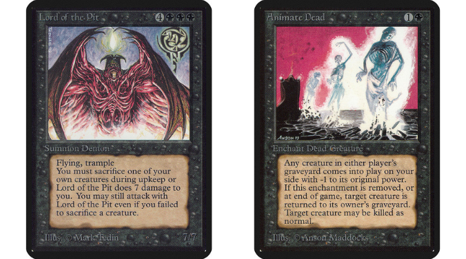
We could easily have had a Lord of the Pit without Tedin’s gnarly exposed musculature, or an Animate Dead without Maddocks’s violent color scheme and screaming skeletons (just look at the more recent printings). Shuler in particular seems to have had a predilection for straight-up slapping pentacles on his art for cards like Demonic Tutor and Unholy Strength. This was a genuinely daring choice during a period where the Satanic Panic was gripping America, and one which unfortunately had the exact results you would expect given that climate.

In the wake of an already-rampant hysteria campaign accusing Dungeons & Dragons of corrupting the youth into real-life devil worship, five parents pulled their teen children out of school when they learned the kids had been playing Magic at after-school clubs. The parents went on to sue the school district for allowing this “promotion of Satanism” to children under teacher supervision. The online record of this lawsuit is a fun read, at least the section attempting to describe the allegedly Satanic activities:
“The Court, like Dr. Dennis, finds the game of ‘Magic: The Gathering’ somewhat arcane to say the least… The directions for the resultant one-to-one combat between the players are both intricate and weird. To describe them would prolong this work unduly.”
Thankfully, this court case found no merit in the accusations against Magic: The Gathering. But Wizards of the Coast understood that the court of public opinion could still crush their game’s future if its controversial elements attracted further negative attention.
EDITIONS AND SUBTRACTIONS
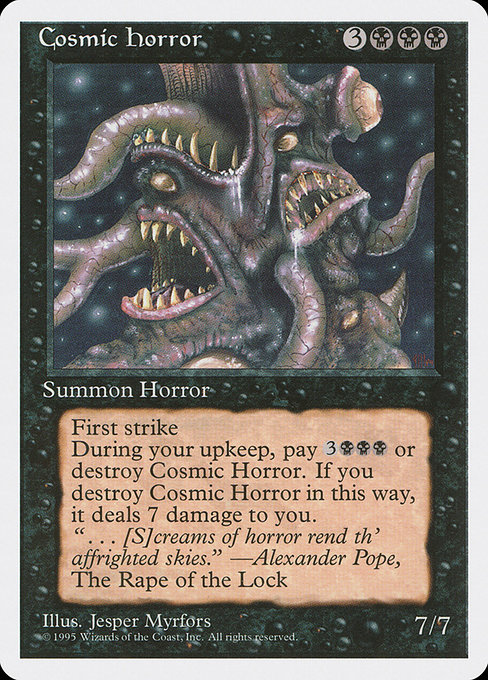
An executive decision was made to remove any direct reference to demons, ritual violence, or recognized occult symbology from the game for the time being. Any Demon-type creatures would not be reprinted, with the less-incendiary “Horror” type being used for large black monsters instead.
Other cards were reprinted only after censoring potentially objectionable elements from the artwork. Most famously, Shuler’s Unholy Strength and Demonic Tutor would appear without their inverted pentacles after Revised. The rush to cover up these symbols was one of the main motivations for reprinting Revised as “Summer Magic” in June 1994, so it seems like this change of aesthetics was already in motion before the parents’ lawsuit. That near miss merely confirmed the necessity of Magic’s retreat from the occult.
While it’s hard to say for sure, this proactive self-censorship may have avoided a more serious moral crusade against Magic from erupting nationwide. In this respect, it was a shrewd and sensible decision.
However, the sheer number of Alpha artworks which one could potentially denounce as suggestive of witchcraft, drug use, criminal violence or sexuality says more about the oversensitive taboos of mainstream America at the time than it does about any real threat to childhood innocence. The Summer Magic cleanup did nothing to censor Quinton Hoover’s bondage-tastic card art for Earthbind, or even the point-blank depiction of ritual murder in Dan Frazier’s Sacrifice illustration.

Ultimately, this whole reaction and counter-reaction did little to weaken the horror-flavored overtones in early Magic, because those aesthetics were not really connected to any particular creature type, color or mechanics – they were the influence of the artists!
All we need do to prove this is look at how they illustrated non-black cards with no inherent connection to the horror genre. Take the snarling, fanged, mohawked visage of Alpha Llanowar Elves, so antithetical to any Tolkien-esque ideas of elvishness.

Or the original Maze of Ith, named after Jesper Myrfors’s own fantasy persona, which took the form not of a brick-and-mortar labyrinth but a stomach-churning mass of intestinal tubes through which humanoid outlines slithered and crawled.

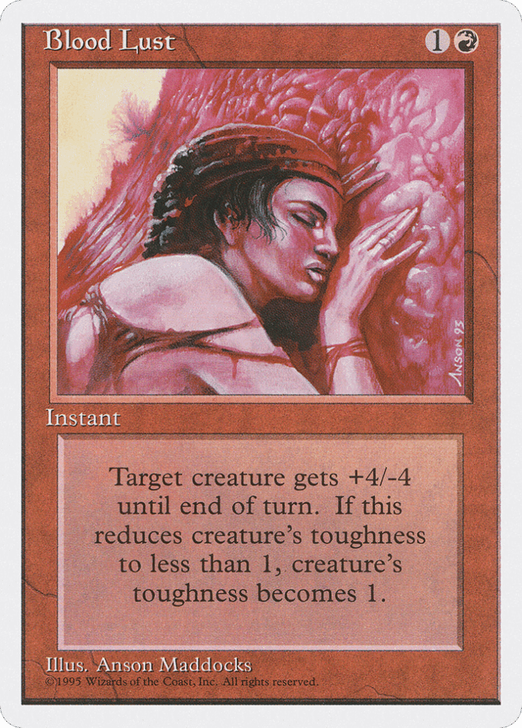
Even the frankly insane choice to interpret a combat trick called “Blood Lust” literally, with a flushed and naked woman pressing herself against a wall of vascular flesh.
With their creative decisions on these cards (and many others), the horror-loving artists of the 1990s ensured this game would not adhere to any trite or generic preconceptions of fantasy.
INDESTRUCTIBLE AURA
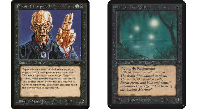
The nascent Magic brand identity was esoteric, mysterious, worldly and confronting. Our sense of awe lies at the very edge of what we can comprehend: genre-blending artwork like Rocket Launcher and Priest of Yawgmoth suggested a world without limits, while the practice of borrowing flavor text quotes from famous literature lent them some extra gravitas.
This era of Magic, one where it could appear genuinely subversive or mystical at first glance, would eventually end by degrees. The Weatherlight saga established a central storyline, setting and characters which would unify the flavor of upcoming sets, and require a more consistent standard for artwork. Myrfors moved on from the company and his ban on digital art was repealed, leading to a slow erosion of stylistic variety – though we have seen a welcome revival over the last five years.
The last two decades have still included excellent horror-themed sets, including the three Innistrad blocks and Duskmourn: House of Horror. But for the most part, those sets have tried to recreate popular conceptions of horror, not the weird and original visions of individual art students.
Opting for the familiar is not necessarily a worse approach, but it is far less able to actually spook or unnerve anybody. And it will never recapture the same kind of occult mystique which so fascinated the early generations of Magic players.

Tom’s fate was sealed in 7th grade when his friend lent him a pile of commons to play Magic. He quickly picked up Boros and Orzhov decks in Ravnica block and has remained a staunch white magician ever since. A fan of all Constructed formats, he enjoys studying the history of the tournament meta. He specializes in midrange decks, especially Death & Taxes and Martyr Proc. One day, he swears he will win an MCQ with Evershrike. Ask him how at @AWanderingBard, or watch him stream Magic at twitch.tv/TheWanderingBard.