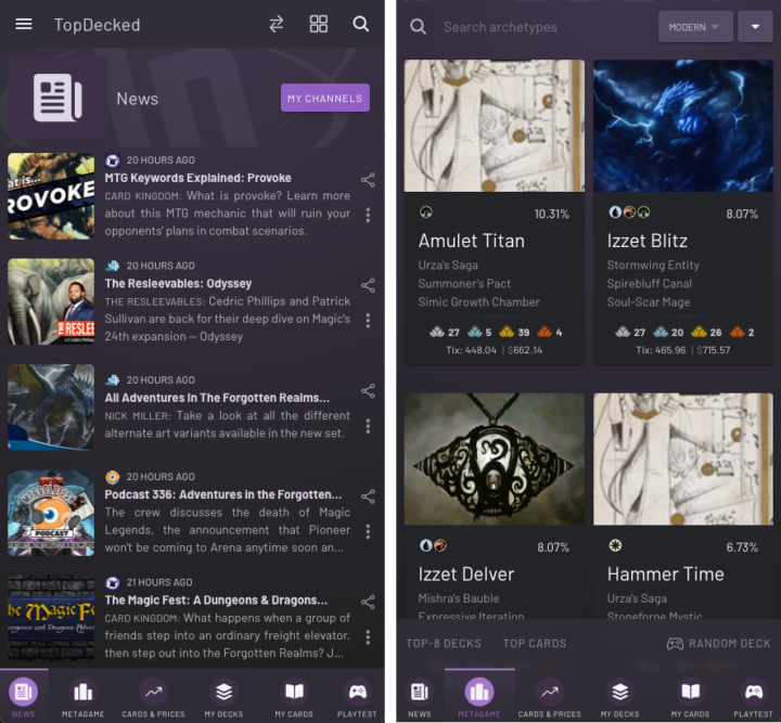
When Card Kingdom asked me if I’d like to write about the TopDecked app this week, I was mostly excited about putting another Magic tool to the test. As someone who’s spent a lot of time thinking about the game and hoarding huge stacks of cards, I’ve been through a ton of different apps and websites since my first Gatherer search in 2005.
Today, my phone is loaded up with various life trackers, collection managers, search engines, rules helpers, and price aggregators. All of them are comfortable, familiar and useful to me, so the bar for a new app to replace one of them is set high — but it turns out that TopDecked is even more ambitious.
This is an all-in-one Magic assistant, challenging users to completely convert how they interact with the game. But the many improvements this app makes over its competition — and some huge advantages it gains from that all-in-one philosophy — have made me a staunch believer.
THE POWER OF ONE
All things being equal, most of us would rather avoid installing 10 apps if just one will do. But the comparison is actually tilted further in TopDecked’s favor. Its different functions benefit from their interconnectivity in ways you won’t always anticipate until you use the app yourself. Your one account even syncs between with your phone, tablet or web browser (wherever you use the app), and it looks fantastic everywhere you do.

If you’re like me and mostly discover new Magic articles and decks based on who’s retweeting them, these screens are already adding a lot of value.
For example, you might first spot a new breakout deck or card from the latest tournament results and strategy articles, which are aggregated on TopDecked’s home tab. Curiosity piqued, you can then take a deeper dive through the “Metagame” tab, where similar published lists have been algorithmically identified and grouped under that archetype.
You can see which cards are core for all builds, and which flex options the app recommends based on aggregate performance in the meta. You can even test the deck or “simulate” in real time, to see if it’s something you’d like to try.
It’s impossible to show all the deck data presented without turning this article into a gallery, but trust me when I say you can click on everything you see here, and you’ll be glad you did.
You can also see which cards from the deck you own, thanks to the collection manager section — and how much it would cost to buy the rest of each deck from various online vendors, thanks to the price tracking section. If that price looks good, you can press one button and have everything you need ordered from Card Kingdom. And you can even playtest hands with the deck in-app while you wait for that delivery to arrive!
The deck simulator fired up for practice-mode.
This little example doesn’t even touch on all the major functions currently available in TopDecked, and there are yet more features still to come. Owner and developer Lincoln Baxter III offered me a pithy explanation for this massive scope: “My plan is to make something that’s so useful for free, Magic players just have to download it — it’s worth having in your pocket.”
As a professional software engineer and a Magic fan, he started this project with the right perspective to find little rough spots in the overall experience of the game; areas where any player could use a bit of automation or number crunching to make Magic less work and more fun.
GIVING THE PEOPLE WHAT THEY WANT
When I interviewed Lincoln, he showed me an unrecognizable, early version of the TopDecked program, which was aimed at helping stores in his area track and publish hundreds of tournament decklists from their events. Store employees had loved it, and players loved submitting decklists through the app, but to many owners, it was just “one more thing” to set up before an event.
That was how Lincoln arrived at his current, ambitious plan for TopDecked: instead of an app which relied on tournaments to do its job, he envisioned an app that did its job so well, users would want to rely on it. He took a full year off from his then-job, carefully meting out his savings so he could visit different stores and Magic communities for research.
“I would go into a store and talk to the owners about [the app], and make sure to buy a booster box,” Lincoln tells me. “And then I’d sit down at an empty table with it, and anybody who wanted to chat with me for a few minutes about the app, I’d offer them a free booster.”
Such shows of goodwill and commitment toward players has been a big part of Magic’s own success over the years, and has helped Lincoln build support for his app, in return. TopDecked is now funded by “Powered” users who pay an optional $4.99 to $13.49 per month to track larger personal collections, get advanced tools for deck building, and access detailed analytics.
Free accounts retain access to all the major functionality, so go ahead and try before you buy.
The TopDecked team is Lincoln and a couple part-time helpers, and the prominent feedback button in its main menu sends messages directly to his inbox. “It takes up a lot of time, but I try to read everything that comes in. It’s very important to me,” he explained, scrolling down hundreds of archived messages sorted by topic.
Surprisingly for such a versatile app, about 80% were feature requests — users who were hoping that TopDecked could maybe do just one more thing they needed!
“I am always looking for ideas to add new features, but I’ve also had to remind myself to slow down,” Lincoln admits. “The app does so much now that I really have to put more time towards promotion, so more people know it’s there and use it.”
The collection tracker is flexible in how you can use different “binders” – this one has been set up as a (very aspirational) wish list – so TopDecked won’t count the contents as cards you own when deckbuilding or using other integrated features of the app.
THE FUTURE OF DECK TRACKING IS NOW
At time of writing, TopDecked is a live and fully functional service, with a bustling user base helping to feed data both to Lincoln and to the app’s deck-analysis algorithms. In addition to tracking their collections on TopDecked and looking up decks from the tournament metagame, users can tab over to a separate section to enter in decklists.
Powerful card search and filtering options make it possible to build decks right there in the app, narrowing down possible selections automatically based on your Commander colors or preferred creature types. Users can also access automatic card suggestions, which are generated from AI analysis of similar user-submitted decks (or tournament results, where available); at any of the paid tiers, you get even more access.
I can quickly build up five-color enchantress from scratch, even on the phone, searching card text for “whenever”+“you”+“enchantment”. The red “legality” message can be swept aside / ignored entirely with “Other” formats, if you want to build by your own house rules.
Running his AI over thousands and thousands of decks has also helped Lincoln build up a list of useful synergies for individual cards, which can be viewed by selecting any card within a list, or for your entire deck via “Ideas.”
Tapping a card brings up the “universal card information overlay,” and shows key rulings (each with lifesaving hyperlinks to the relevant clause of the Comprehensive Rules), price and usage history, a list of alternative printings, and the card’s current legality status across all formats. It’s one of the most obvious places where the UI design of TopDecked shines through, but the overall experience is incredibly intuitive and smooth whether on smartphone or PC (your account’s collection and decklist data is maintained across both platforms).
A GREAT IDEA SELLS ITSELF
It’s already more convenient to gather all your Magic needs in one app window. But when you can switch instantly between different functions without losing your place — and easily pull in detailed analytics or TopDecked’s powerful card search/filtering panel from anywhere in the app — everything becomes gloriously efficient. Phyrexia would be proud!
The card-price tracker shows off the granular detail present in every part of the app, letting you filter and sort this familiar data, as well as anything on the market.
This is why it’s still great to see Lincoln adding things like a life tracker, despite a huge array of excellent life-tracking apps already on the market. When you use the tracker within TopDecked, you never need more than a quick touch to pull up the card search and check a tricky ruling mid-game, or review the Oracle text of a full-art card. These little moments of convenience are what make the strongest case for adopting TopDecked as your Magic support structure.
The multitude of extra options and features totally unique to TopDecked (I haven’t even mentioned how it automatically tracks the history or “change log” of cards moving in and out of your saved decklists between edits!) are just a considerable cherry on top of the deliciously useful cake.
The life-tracker is as intuitive as it looks, with the ability to roll dice, track commander damage / poison, and see the game’s history. You can even send it to the background to look up cards during a game.
I’ve tried a lot of powerful Magic apps which ultimately didn’t “stick,” especially when it comes to managing my own mammoth paper collection. Using TopDecked and talking with its creator drove home how much those fruitless trials came down to awkward design; tools which weren’t convenient enough to justify changing my habits. But I’m excited to import my existing card list into TopDecked and start fresh — and I feel confident recommending you to take one of the built-in “feature tours” for yourself. By the time you see everything Lincoln packed into this app, I think you’ll already know what parts of your Magic experience it might make easier.
I think it’s time to “Get TopDecked.”

Tom’s fate was sealed in 7th grade when his friend lent him a pile of commons to play Magic. He quickly picked up Boros and Orzhov decks in Ravnica block and has remained a staunch white magician ever since. A fan of all Constructed formats, he enjoys studying the history of the tournament meta. He specializes in midrange decks, especially Death & Taxes and Martyr Proc. One day, he swears he will win an MCQ with Evershrike. Ask him how at @AWanderingBard, or watch him stream Magic at twitch.tv/TheWanderingBard.

