

It seems to be that as time goes on, Magic becomes harder and harder to decipher. Complexity creep on cards is one thing, but what about the complexity of game pieces? Kristen sits down to talk about accessibility in Magic.
For many of us, Magic’s artwork is a big draw. Without the stunning vistas, fierce warriors and heroic (or villainous) acts depicted on those little cardboard rectangles, I don’t think half of us would be playing. We pick which artwork we love the most to put in our decks, whether it’s our Commander or our Basic Lands.
Magic in 2023 has a smorgasbord of options; borderless, textless, different frame treatments, different foil treatments… how do you go about choosing? For me, at least, I like to choose the regular version of cards quite often.
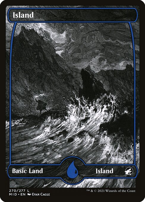
I like most of my cards to have traditional frames. I like an etched foil, but only for my Commander. I like full art treatments, but not for permanents. And I hate the Midnight Hunt/Crimson Vow basic lands with a passion.
But why am I so particular about the card styles I choose to use? Well, I’d argue that Magic in 2023 has an accessibility issue when it comes to readability of game pieces. The question is, how did we get here?
MAGIC ALTERS ARE OG COOL
Before Project Booster Fun properly got off the ground, the main way players expressed themselves with card treatments that weren’t textless Cryptic Command (can you believe they printed textless Omnath the other year?!) was to commission artists to hand paint altered art onto cards.
The legality of these pieces was such that as long as there was no demonstrable thickness that could affect shuffling and identification in sleeves, and as long the name and mana cost of the card were visible… you could play the card legally.
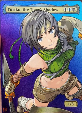
With alters, there are as many styles as there are artists, from the anime precision of Sablan MTG Alters’ team to the atmospheric and referential work of SKAltered, some of these skilled folks go hard. No wonder Wizards decided that anime art would be popular, eh?
Other than promo cards and other rarities, it would be a while before experimenting with what a Magic card could look like became the norm. Standing on the precipice of Project Booster Fun, we got the Zendikar Expeditions and the Kaladesh Inventions.
Compared to more recent treatments, these ones are still revered by the playerbase. The unique but restrained experimentation with the frame and relative rarity grants them a certain luxuriousness, sure — but I think the main factor is actually that they’re easy to read.
To be specific, I’m talking about heuristics.
HEURISTICS
Heuristics are an intrinsic part of game design. In short, they are mental shortcuts that ease the cognitive load of making a decision. Most commonly, we think about them in regards to gameplay.
Finding an optimal line of play might be impractical given time constraints, or it might even be impossible, so we rely on heuristics to help us make the best decision we can. These heuristics range from “what is my usual out in this matchup,” to “I know I can’t let them resolve this spell,” to “drafting flyers is always good.”
They aren’t the only heuristics we use playing Magic, though. Any Commander player will tell you that keeping track of multiple board states playing cards from a huge card pool is very difficult.
If we look at ten usability heuristics commonly applied to video games, there are multiple that, when applied to magic, rely on game pieces rather than game state: visibility of system status, consistency and standards, error prevention, recognition rather than recall, and aesthetic and minimalist design.
While Mark Rosewater’s 20 Years/20 Lessons GDC talk has many valuable nuggets, not least on front-loading of information, it feels like the game as it is today has forgotten some of those lessons.
COMPETITION RELIES ON HEURISTICS
Competitive card games rely on heuristics. The reason why Standard format is the most successful in any game is because players can deal with a smaller card pool and therefore rely more on heuristics than in-the-moment decision making.
It’s also why Legacy and Modern players have been known to whine when someone takes a deck ported from another format and crushes a tournament with it. It’s not “fair” that they were made to use their brain more than heuristics, apparently.
A small card pool is just one part of what makes a game legible, though. It’s also about having a board state that’s readable.
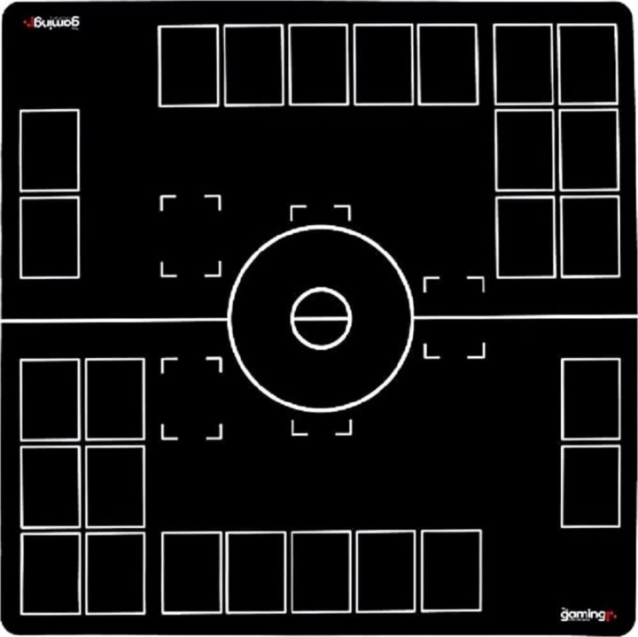
If I show you this GMC Classic playmat, most card game players can tell straight away that it’s for the Pokémon TCG. But if you’re at all familiar with the game, you can also point out the six prize zone, the deck, the discard pile, the benched pokemon, the active pokemon, the place to put stadium cards and the place for the played Supporter or card while it is being resolved.
The other main popular TCGs, Flesh and Blood and Yu-gi-oh, have similarly structured battlefields. Doing this allows players to understand things at a glance and reduce that cognitive load.
Of course, beyond dividing lands and nonland permanents — something that, until recent years, wasn’t even set in stone — Magic has a less strict system. Until recently, however, it still employed the use of card frames to denote card types.
Artifacts (previously brown) are a metal color. Enchantment creatures have the Nyx-style starry frame. Enchantments themselves can be distinguished from creatures due to lack of Power/Toughness, but also in terms of art direction. Planeswalkers are, well… Planeswalkers.
Since Expeditions and Inventions — which arguably fit within Magic’s usability goals, given they are always lands or artifacts, and crop up rarely — things have taken a turn for the complex.
WHAT IS A MAGIC CARD
Rhystic Studies’ has an excellent video on the history of framing in Magic. On the “Masterpiece Experiment,” Sam states that where they “fail on functionality, they greatly succeed in delivering that immersive experience, that pleasure that comes from owning a piece of treasure despite it serving no real use.”
While our views may differ on which frame treatments are “functional,” there’s no denying that accessibility is a big part of the conversation.
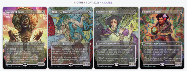
Playing my friend’s cube, I made a major misplay because I failed to retain that Mother of Runes was in play. Though the relaxed play environment, busy playmat and my (unmedicated) ADHD no doubt had an impact, I cannot tell you to this day which of the SLD arts my friend deployed — only that I completely missed it on the board. I love full art treatments (and this iconic SLD), but on this occasion, they failed to be functional.
As much as Cube is customizable, it’s still a vaguely consistent experience, especially when built to Legacy or Modern power levels. The iconic Mother of Runes art, and the iconic modern frame, were not there to be relied upon as a heuristic in a semi-competitive environment that lacks the takesie-backsie nature of Commander.
Commander isn’t immune to this issue, though. I vividly recall a game where, for most of the game, my opponent placed their hand face down on their battlefield between turns. There was no malice intended, but toward the end of a nearly 3 hour game, I failed to spot a Morph creature laid down to block.
Damn, that felt bad. The heuristic I developed, subconsciously, was that my opponent placed their hand on the battlefield. Morphs hadn’t been part of the game up until that point. It felt bad to lose in such a way due to cognitive fatigue.
A MAGIC CARD IS A RECTANGLE WITH RULES TEXT
…most of the time, at least. We’ve reached a point over the past few years where the game has become increasingly inaccessible. Part of that is the sheer volume of new cards to keep track of; another part is the complexity of cards and the artificial rotation of eternal formats via power/speed creep.
A big part of that complexity, though, stems from lack of care when it comes to usability and accessibility.
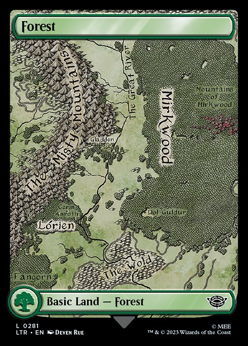
Emma Partlow’s article on collectability vs accessibility is a cornerstone piece. Since then, we’ve had more illegible basic lands.
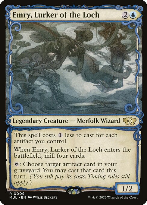
And that’s not all we’ve had, either. Elesh Norn, Mother of Machines has twelve unique printings, some of which are in the same art style as treatments for Elesh Norn, Grand Cenobite. Good luck trying to figure out whether it’s an OG Praetor or a new one across a Commander table, I guess.
March of the Machines’ Multiverse Legends was a real mixed bag for a similar reason. For every baller frame treatment like the Ravnica frame, Wizards dropped the ball on accessibility.
They dipped again into grayscale for the Tarkir frame. They gave creatures the Kaladesh Invention frame… but there was clearly some usability concern, because they went to the effort of making the artwork for said characters post-war statues. Statues are usually not creatures, though, or they have Defender.
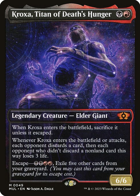
Kroxa got the Theros Stargazing treatment, which feels weird for a non-enchantment creature. Again, some compromise was taken by not granting the Nyx-star border, but is it enough?
I’d say no because it rips us away from our heuristics.
Those cards were Gods. Is Kroxa “online”? Yes, always. Is there a potential story-beat where the Theros populace worship these Titans as Phyrexia invades, giving them constellations? …shrug.
As much as I love the Eldraine storybook frame, putting text across a book like that just isn’t how books work. At least it’s otherwise accessible, though. It doesn’t detract from existing heuristics, there’s nice contrast and the card ostensibly fits the framing of a Magic card.
It’s a minor frustration indeed, especially compared with the agonizing reality that we have two different stained-glass arts of Radha, Coalition Warlord in one year, while the two arts of Shanna depict entirely different cards.
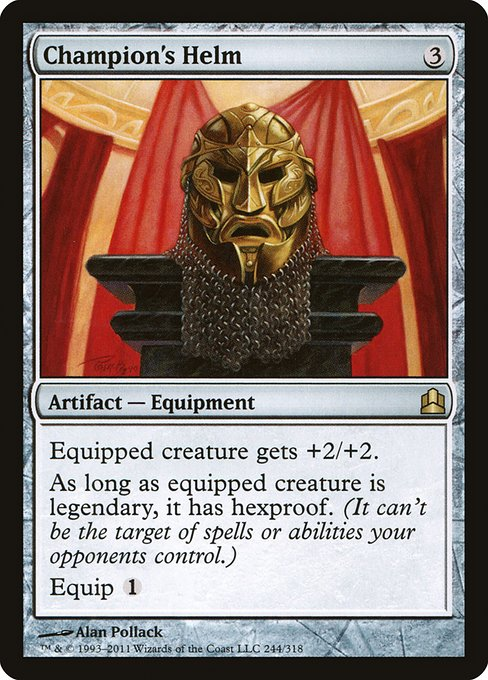
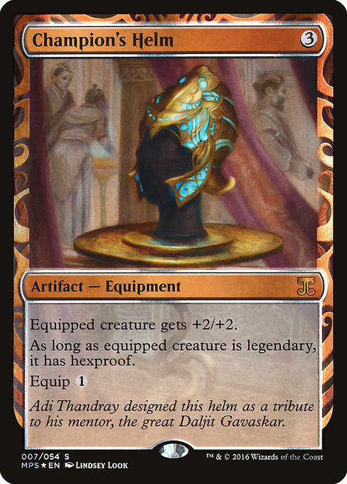
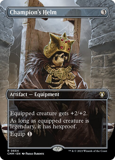
Art and framing are intrinsically linked, and the importance of communicating heuristics should take precedence over looking “cool.” Champion’s Helm has progressed from a clear equipment Artifact to… what?
An Enchantment to do with… the undead? Or is it a character? Or a vehicle, even? It’s honestly hard to tell, and it’s not just the framing that’s the issue.
Art direction is a big slice of the accessibility pie. While art can be technically adept, and aesthetically pleasing, the art direction is what impacts legibility.
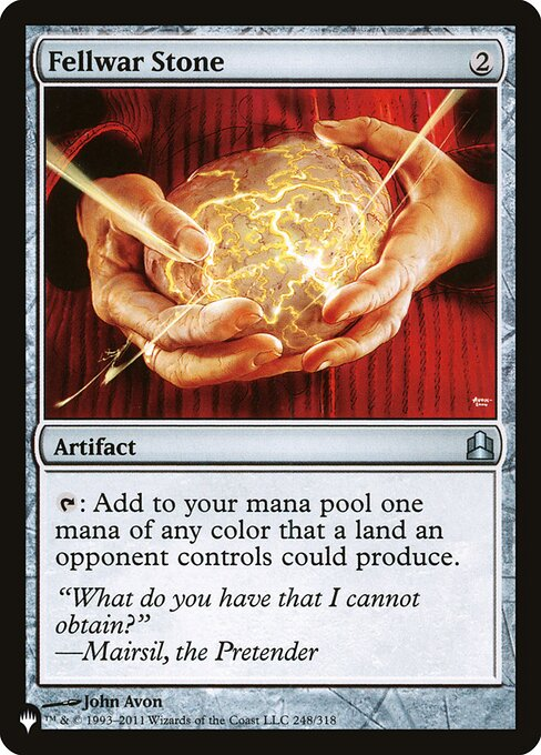
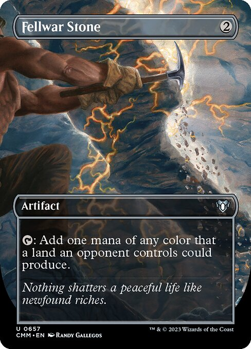
The CMM Fellwar Stone could be an Enchantment about Mining. It could also be an instant with a title like “Strike of the Oppressed.”
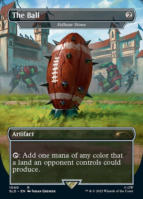
At least the Blood Bowl art uses focus to ensure The Ball is framed just as artifacts are traditionally framed. Who cares if you enjoy 40k — you can read the card and know it’s an object, and therefore probably an Artifact.
THE AGE OF SPELLTABLE
Much has been said about Magic designing for Arena. Modal cards, cards that replace themselves, cards that are good in Best-of-One queue.. they’re all factors that have influenced card design in Standard sets over the years. I just wish that Spelltable had a similar impact on accessibility.
Spelltable shouldn’t dictate how cards are designed. I’m not saying get rid of cards like Gonti, Lord of Luxury that are hard to resolve over webcam. But I am saying that many of the adjustments Spelltable players make are with accessibility in mind.
Takesie-backsies and good sportsmanship is elevated when board states are complex and cards are hard to identify. Tokens cannot be represented with dice. Indeed, Infinitokens took off as a way to help make board states more readable.
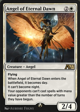
Angel of Eternal Dawn is an Arena-only card. Tracking turn numbers in paper is deemed too complex for players to track. The irony is that this rules text shares a card with the notorious Night/Day mechanic, and since it was released on Arena, we’ve had far more complex cards introduced to the Commander especially.
And honestly? I’d have less issues tracking the number of turns in a game than I do trying to grok a board state in 2023. The City’s Blessing happens way sooner than you’d think, given the format’s deluge of tokens — whether Food, Treasure or creatures — and The Count of Monte Questing Beast has had multiple sequels.
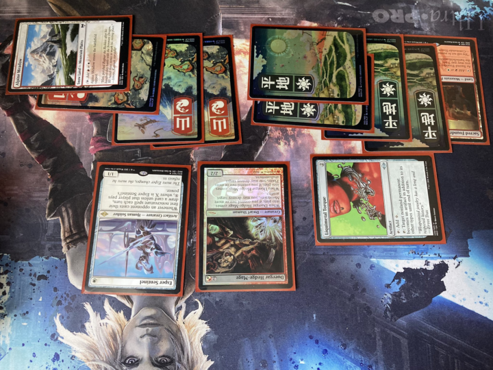
The thing is, Wizards of the Coast is capable of designing with accessibility in mind. Take my opponent’s board state above.
Even upside down, we can ascertain just how much mana they’re holding up. The Neon Dynasty japanese basics were a home run, in part due to just how great they are being functional game pieces. The left-aligned mana symbol fulfills many tenets of game design usability, and they look badass, too. What’s more, my opponent is also playing an artifact creature (represented by the border) and a mana rock.
Magic has the capability to be an accessible game, but as time goes on, that accessibility has been sacrificed at the altar of Project Booster Fun. Part of my role on the Commander Advisory Group is to feed back to Wizards what’s going well and what isn’t. I don’t see any reason why that feedback can’t extend to the long-term accessibility of the game.
As someone with ADHD, I’ve long-threatened to write a piece on my experience playing card games both competitively and casually through that lens. It’ll make a great follow-up to this piece for sure, but I think we’ve reached a point where we have to shout back to Wizards that something has to change. It’s not just neurodivergent folks that can struggle with accessibility.
Accessibility is profitable. We can talk about retention all day, but new user conversion is the primary metric of any corporation these days. And if nothing else, the accessibility of a game dictates how many players will pick it up.
Complex game systems with excessive on-ramp difficulty aren’t fun for the average user. It’s why Fortnite dominates the market, and why Team17’s excellent Hell Let Loose is unplayable without a squad of players who have the same goals and understanding of the game.
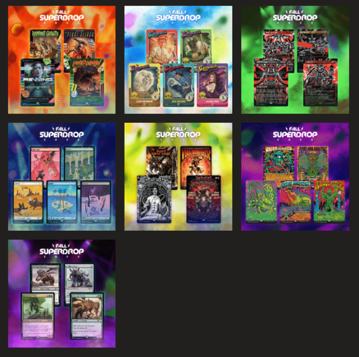
If you scroll down far enough, you might find some Magic cards in the Fall Superdrop.
Far be it from me to tell you how to enjoy Magic. There’s an art treatment out there for everyone, especially with Secret Lair.
Go, pick up what speaks to you. Enjoy that cool art treatment. Seeing a cool alter or funky card in the Command Zone will always be sweet.
Opting for Unstable basics in your four-color deck to help with fetching basics is inspired. Foreign language cards, Universes Beyond, Expedition lands, and showcase treatments aren’t the problem.
The problem is abandoning the time-honored accessibility heuristics of framing and art direction in favor of collectability. Magic is a worse game for it, and I can only hope the ship turns around.

Kristen is Card Kingdom’s Head Writer and a member of the Commander Format Panel. Formerly a competitive Pokémon TCG grinder, she has been playing Magic since Shadows Over Innistrad, which in her opinion, was a great set to start with. When she’s not taking names with Equipment and Aggro strategies in Commander, she loves to play any form of Limited.